Redesigning for better usability and engagement online

Education Council website

Client

Client

Education Council, New Zealand

Education Council, New Zealand

Services

Services

Design Workshops User Experience Design User Interface Design Responsive Design

Industries

Industries

Education

Date

Date

2019

Education Council website on a mobile device

Problem

The Education Council website had become outdated, with no significant updates for years. It faced usability issues and no longer effectively met the needs of its audience. While a full redesign was planned for the future, there was an immediate need to address the most pressing pain points and make the site more engaging. The goal was to enhance usability, create a more visually appealing design, and improve the overall user experience through clearer messaging, better navigation, and the use of photography.

The Education Council website had become outdated, with no significant updates for years. It faced usability issues and no longer effectively met the needs of its audience. While a full redesign was planned for the future, there was an immediate need to address the most pressing pain points and make the site more engaging. The goal was to enhance usability, create a more visually appealing design, and improve the overall user experience through clearer messaging, better navigation, and the use of photography.

Workshops findings
Workshops findings
Workshops findings

Solution

To improve the website in the short term, an updated user experience and visual design for key elements such as the global header, footer, and homepage were created. The redesign aimed to make the homepage more engaging and navigable for users, while staying within the existing brand and style guidelines. A design workshop was facilitated at the start of the project to align stakeholders, validate user pain points, and define goals for the website’s new experience. The updated colour palette was thoroughly audited for accessibility compliance using the WCAG 2.0 accessibility guidelines to ensure the site was inclusive for all users.

To improve the website in the short term, an updated user experience and visual design for key elements such as the global header, footer, and homepage were created. The redesign aimed to make the homepage more engaging and navigable for users, while staying within the existing brand and style guidelines. A design workshop was facilitated at the start of the project to align stakeholders, validate user pain points, and define goals for the website’s new experience. The updated colour palette was thoroughly audited for accessibility compliance using the WCAG 2.0 accessibility guidelines to ensure the site was inclusive for all users.


Key design decisions

Improved user experience

Short-term improvements addressed usability pain points, enhancing navigation and accessibility.

Engagement through visual design

The use of photography and a refreshed visual design increased user engagement.
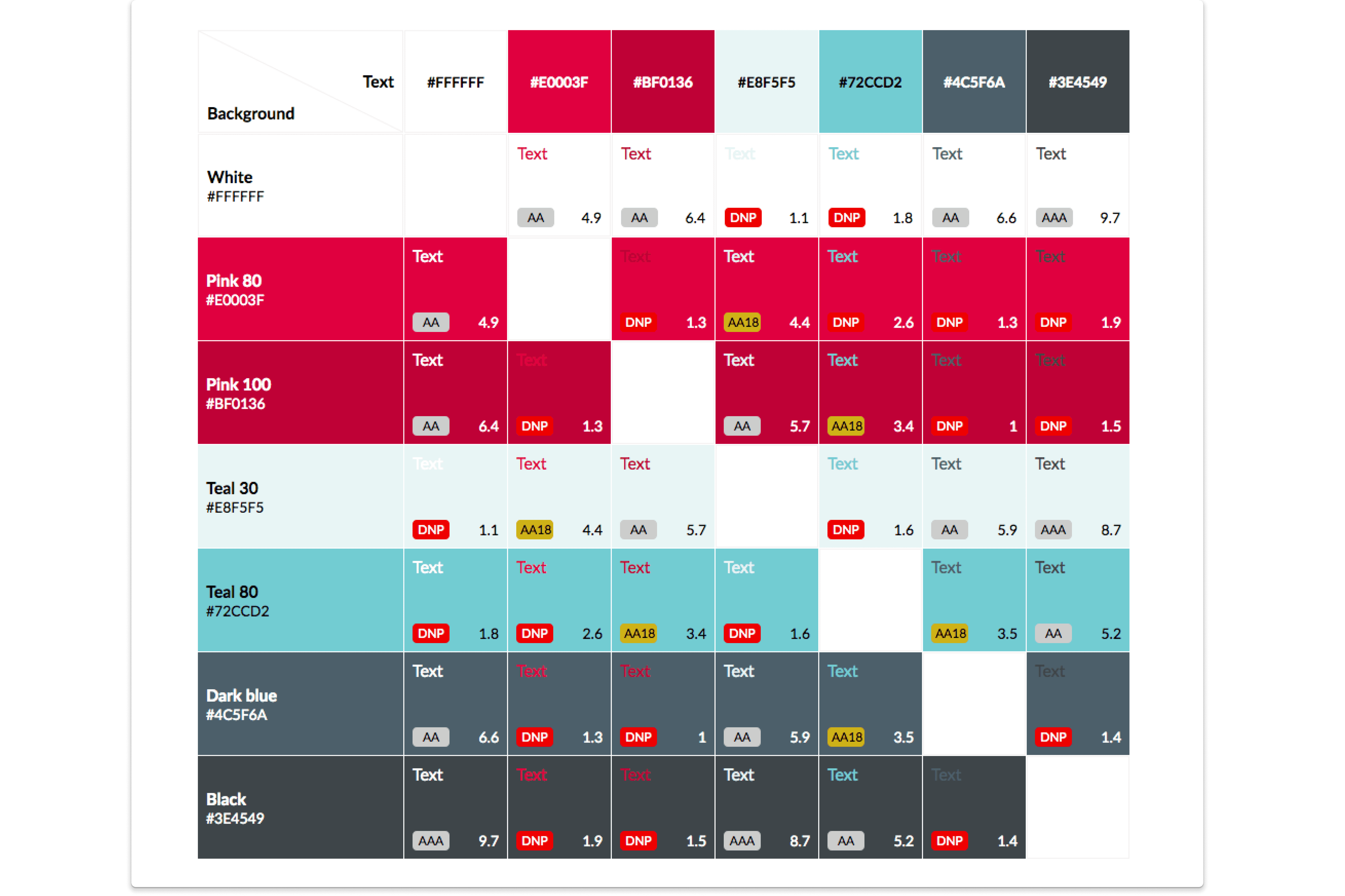
Accessibility focus

Auditing the colour palette against WCAG 2.0 ensured the site was accessible to a broader audience.

New main menu navigation design
Colour accessiblity check for Education Council website

Impact

The updates significantly improved the user experience on the Education Council website. The homepage became more visually engaging, with clearer messaging and better navigation. Users found it easier to access key information, improving engagement with the site. The accessibility audit ensured that the website was more inclusive, meeting WCAG 2.0 standards for a wider audience. These changes provided a more functional and appealing website experience, even as the full redesign was planned for the future.


Key takeaways

Refreshed homepage design

A more visually engaging homepage with clearer messaging and streamlined navigation.

Accessibility compliance

Ensured the colour palette met WCAG 2.0 guidelines for accessibility.

Stakeholder alignment

A design workshop was conducted at the start to ensure all stakeholder goals and user needs were addressed.

Education Council website on a mobile device

© Nicole Rush 2025

Senior Product Designer based in Ontario, Canada

© Nicole Rush 2025

Senior Product Designer based in Ontario, Canada

© Nicole Rush 2025

Senior Product Designer based in Ontario, Canada